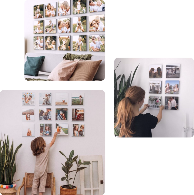
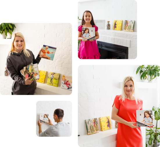
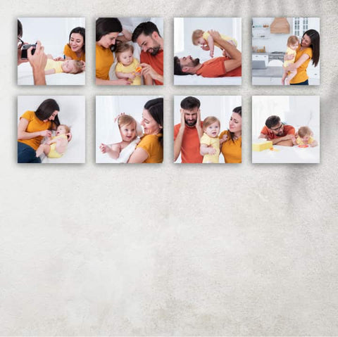
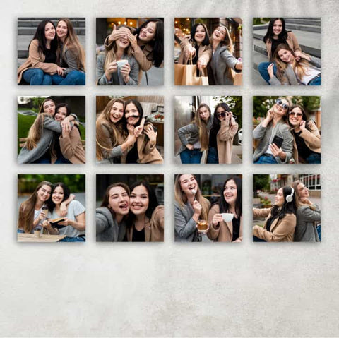
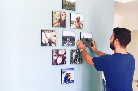
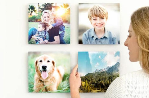
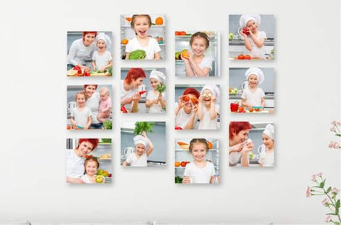
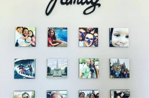
Personalized photo ledges offer a creative and versatile way to showcase your favorite canvas prints and photo tiles, adding a dynamic element to your home decor. Unlike traditional picture hanging, which commits your display to a permanent arrangement, photo ledges allow for an evolving art gallery in your very own space.
You can effortlessly rotate images, themes, and memories, ensuring that your walls always reflect your current style, mood, or season. This introduction to using photo ledges will guide you through selecting the right ledges for your space, arranging your artwork for the best visual impact, and tips for keeping your display fresh and engaging. With photo ledges, you're not just hanging pictures; you're curating an intimate story that evolves with you.
Selecting the Right Photo Ledges
When choosing the perfect photo ledges for your space, consider several key factors to ensure they not only complement your decor but are also functional for your needs.
- Material: Photo ledges are typically crafted from wood, metal, or acrylic. Wooden ledges bring warmth and a natural element to your space, suitable for traditional or rustic interiors. Metal ledges offer a sleek, modern look, ideal for contemporary rooms, whereas acrylic ledges provide a minimalist, almost invisible appearance, letting your photos take center stage.
- Length: The length of the ledge should match the scale of your wall and the size of the collection you plan to display. Longer ledges can accommodate more artwork and create a statement piece, while shorter ledges are perfect for small spaces or a more understated look.
- Depth: Ensure the depth of your photo ledge is sufficient for the frames you intend to display. Most ledges range from 3 to 5 inches deep, providing ample space for most standard photo frames and canvases.
- Finish: The finish of your photo ledge can significantly affect the overall aesthetic of your display. From natural wood stains to glossy paints or metallic finishes, choose a look that complements your existing decor and color scheme.
Matching photo ledges with your home’s aesthetic involves aligning these elements with your decor style. For a cohesive look, consider the dominant colors, textures, and materials in your room. A well-chosen photo ledge can enhance your existing interior design by echoing its key features, such as wood tones in traditional spaces or metallic accents in modern environments. Ultimately, selecting the right photo ledges allows you to create a personalized display that feels integrated with the overall style and charm of your home.
Arranging Your Artwork
Tips for Choosing Prints and Photo Tiles for Display
Selecting the right prints and photo tiles for your ledges is crucial for creating a visually compelling display. Aim for a mix of personal photos, artwork, and perhaps even textual elements that speak to your tastes and memories. Consider the color scheme of your room when choosing prints, opting for images that complement or thoughtfully contrast with your decor. Additionally, varying the size and orientation of prints adds interest and allows for a dynamic arrangement.
Arrangement Strategies for Visual Balance and Impact
To achieve visual balance, start by placing your largest or most eye-catching piece slightly off-center, which acts as an anchor for the rest of your display. From there, surround it with smaller pieces, maintaining a mix of vertical and horizontal orientations. This approach prevents any one side from appearing too heavy. Remember, symmetry isn’t necessary for balance, but do aim for an even distribution of visual weight across the ledge.
Creating visual impact also means playing with heights and dimensions. Place taller pieces behind shorter ones to create a sense of depth. For an engaging display, incorporate items of different textures or materials alongside your photos, such as small sculptures, plants, or keepsakes. These elements add variety and personal touch to your photo ledge.
The Importance of Spacing and Layering for Depth
Proper spacing between your frames and objects is key to preventing the display from feeling cluttered. Aim for at least an inch of space between smaller items, increasing the gap for larger pieces. This spacing allows each piece to stand out and enables easier adjustments when you want to update your display.
Layering is a useful strategy for adding depth and interest to your photo ledge. Position some frames so that they slightly overlap, creating a layered effect that draws the viewer’s eye across the display. Be mindful not to overcrowd; the goal is to create a sense of depth and texture, not to obscure the artwork.
By considering these aspects of choosing prints and arranging them with balance, spacing, and layering in mind, you can transform your photo ledges into a captivating focal point in your home that reflects your personal style and evolves with your life's moments.
Creating a Rotating Gallery
Step-by-Step Guide to Rotating Your Displays
Rotating the artwork on your photo ledges refreshes your space. Here's a quick guide:
- Prepare Your Artwork: Select prints, photo tiles, and objects for your new display. Clean these items and the ledge for a pristine setup.
- Plan Your Theme: Choose a theme, whether it's seasonal, based on travels, family events, or inspirational.
- Layout Before Placement: Arrange your selections on the ground first, allowing for creative layouts without commitment.
- Start with Largest Pieces: Position these first for structure, then surround them with smaller items, considering balance and spacing.
- Rotate Regularly: Schedule changes to your display to keep it dynamic—consider seasonal updates or after significant events.
Ideas for Thematic Galleries
- Seasonal Galleries: Match your decor with the seasons for a timely refresh.
- Travel Memories: Combine vacation photos with keepsakes for a personal touch.
- Family Milestones: Chart your family's growth and celebrations.
- Favorite Quotes and Inspirations: Blend motivational sayings with related artwork.
Keeping Your Gallery Fresh
- Incorporate New Pieces: Add new finds to keep the display evolving.
- Mix in Non-Photographic Elements: Introduce variety with objects like plants or candles.
- Change with the Seasons: Update your ledge to reflect the time of year.
- Invite Participation: Make your display a collective project, enriching its diversity and personal significance.
By adhering to this guide, you ensure that your photo ledge remains a captivating element of your home, telling your story in a unique and evolving manner.